

Rで散布図を作りたいが、同じ値を取る点が重なってしまう
点が重なってしまうと、データ数の偏りがわからない
蜂群図(ほうぐんず)というグラフを作成すると点が重ならずに表示できるらしい
ggbeeswarmというパッケージを追加してやってみた
GitHub - eclarke/ggbeeswarm: Column scatter / beeswarm-style plots in ggplot2
Column scatter / beeswarm-style plots in ggplot2. Contribute to eclarke/ggbeeswarm development by creating an account on...
github.com
> install.packages('beeswarm')

# 上のコマンドでインストール出来なかったら以下を実行
install.packages('devtools')
devtools::install_github('eclarke/ggbeeswarm')

> library(beeswarm)

> a <- c(1, 2, 2, 3, 3, 3, 4, 4, 4, 4)
> b <- c(1, 2, 3, 4)
>
> x <- c(rep('a', length(a)), rep('b', length(b)))
> y <- c(a, b)
>
> df <- data.frame(x, y)
>
> ggplot(df, aes(x=x, y=y)) + geom_point()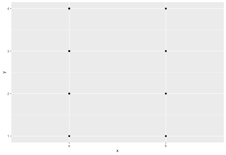
aとbでは各値の個数が違うのに、散布図では全く同じデータに見えてしまう
> ggplot(df, aes(x=x,y=y)) + geom_beeswarm()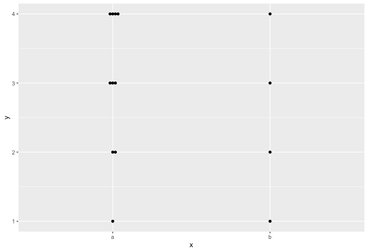
蜂群図にすることで各値の個数も把握することができ、俯瞰性が高い
これに統計要約を表す「箱ひげ図」を組み合わせるとデータの把握がわかりやすくなるのでオススメ
> ggplot(df, aes(x=x,y=y)) + geom_boxplot() + geom_point()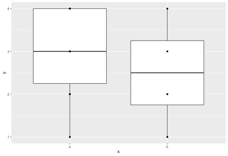

コメント